Concept project Design exhibition — Fondation Sève, Brussels
Organic Futures
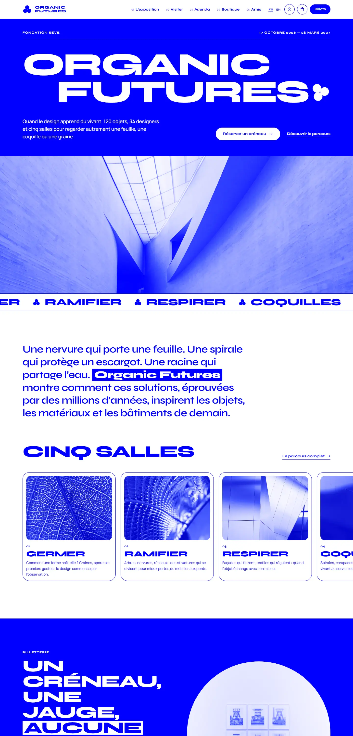
The website of an exhibition on nature-inspired design: timed ticketing, an interactive floor plan, events, a shop and a Friends area.
01The brief (imagined)
The starting point
Organic Futures is an imaginary exhibition on nature-inspired design, presented by the (fictional) Fondation Sève in Brussels. The brief: a strong identity, recognisable on a poster and a phone alike, timed ticketing to manage visitor numbers, and a website that extends the visit (audio guide, favourites, shop).
02Goals
What the website had to achieve
- 01
Create a radical two-colour graphic identity
- 02
Sell timed tickets with visible capacity
- 03
Prepare and extend the visit: map, audio guide, favourites
- 04
Bring the shop and Friends membership to life
03Research & inspiration
What we observed
- Museum websites are often institutional portals where the exhibition disappears. Here, the exhibition is the brand.
- Visitors want to know whether they’ll queue: showing remaining places per slot reassures and smooths attendance.
- Inspirations: cyanotype botanical plates, Swiss posters, the “pure” blue of technical drawings.
04Site map
A structure built around journeys
- Home
- Exhibition — 5 rooms
- Viewer + audio guide
- Visit
- Interactive plan
- Timed ticketing
- E-ticket + QR
- What’s on
- Shop + basket
- Friends
- Members
- Card, tickets, favourites
- Sign in
- Legal · Privacy · Cookies · 404
Every page exists in French and English, linked with hreflang, with its own title, description and structured data.
05Design choices
Colours, typography, components
- Pure blue
#0000FFidentité8.6:1 AAA - White
#FFFFFFfond8.6:1 AAA - Pale blue
#E8E8FFsurfaces7.1:1 AAA - Blue ink
#0A0A3Ccontraste18.7:1 AAA
Syne, extra-wide and graphic, acts as a logotype in every heading. Manrope handles reading. All photos are turned into blue duotones for complete consistency. Fonts are self-hosted (no calls to Google Fonts) for speed and GDPR compliance.
06Key features
Built for the trade
01
Timed ticketing
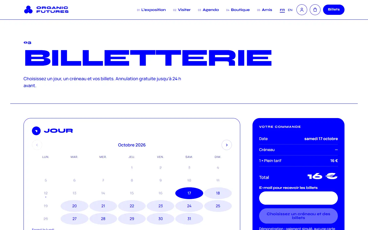
A calendar limited to exhibition dates (closed Mondays), 30-minute slots with visible capacity, prices including Article 27, an optional audio guide, an e-ticket with QR code and calendar export.
02
Interactive floor plan
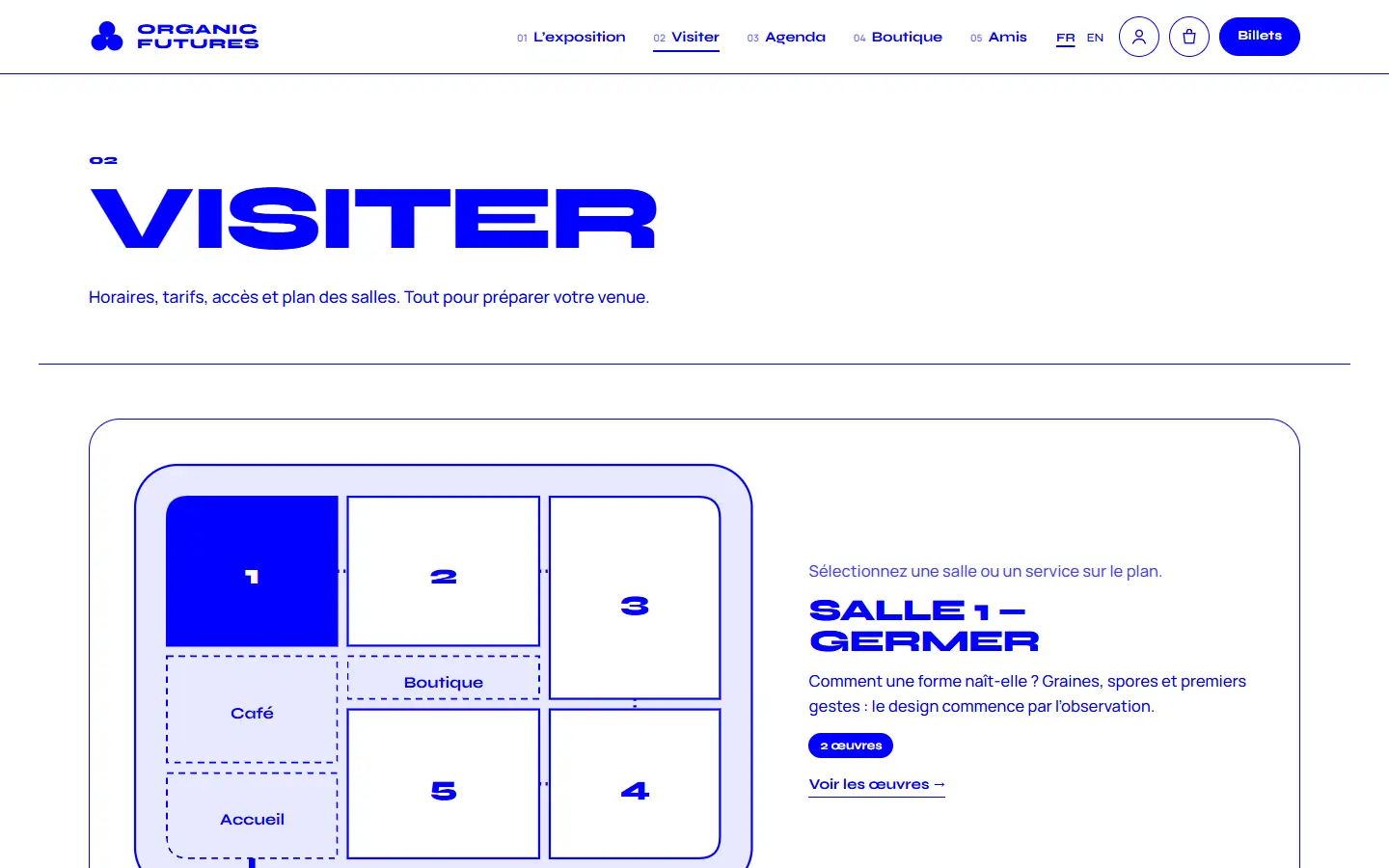
Every room and service is a keyboard-accessible button; selecting one shows the room’s theme, the number of works and a direct link.
03
Route + audio guide
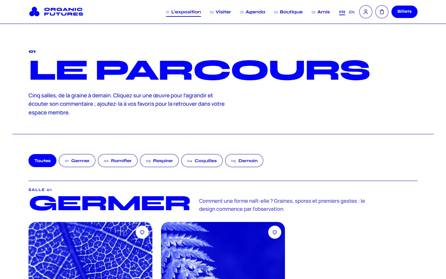
Works by room, a keyboard-friendly viewer, favourites, and an audio guide read by the browser’s speech synthesis — no audio files to produce — with a transcript.
04
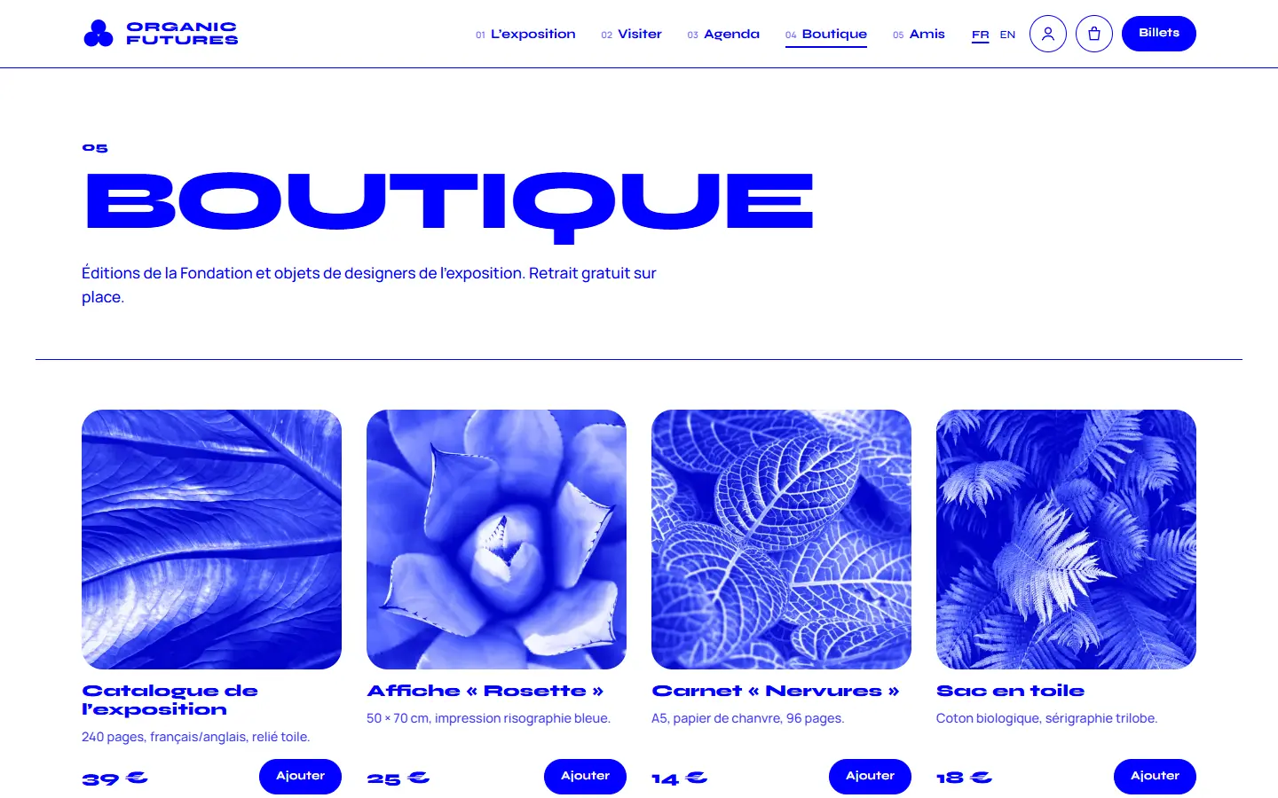
Shop & basket
A persistent side basket, editable quantities and a live total; ready to connect to real payments (Stripe, Mollie).
07Visual results
On mobile, no compromise
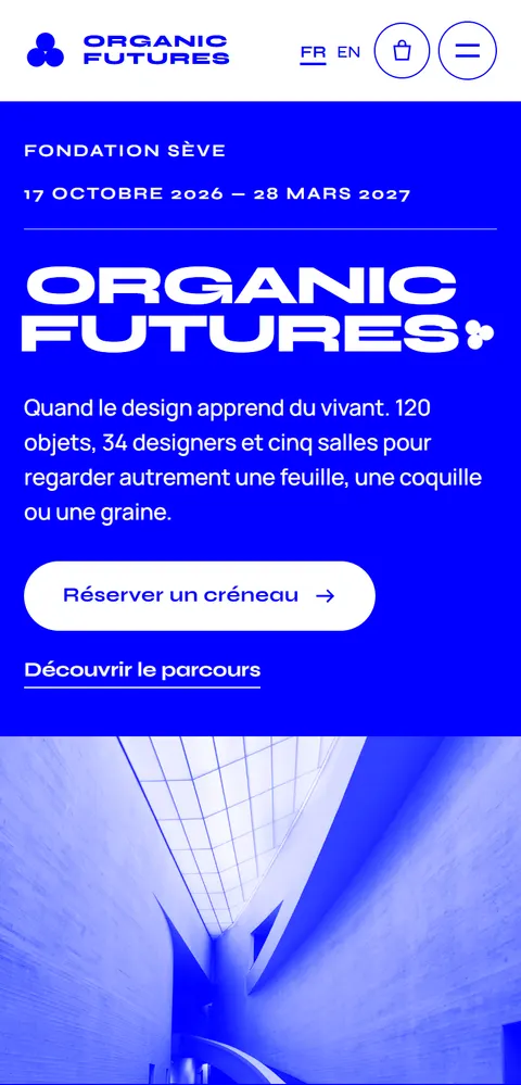
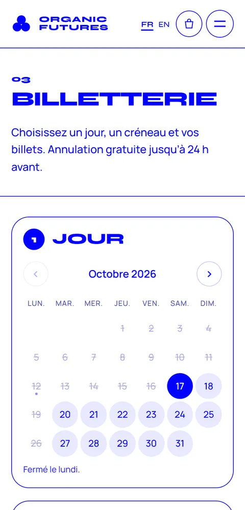
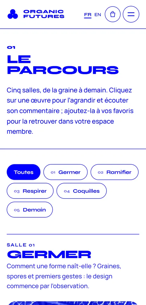
- Responsive from 320 px to 2560 px
- Full keyboard navigation, visible focus
- Responsive WebP images, lazy loading
- Compliant cookie banner and legal pages
- Animations disabled when users ask for it
- schema.org structured data
A similar project?
Let’s talk about your business: free first conversation, fixed quote within 48 hours.
Next case studyRoche & Associés